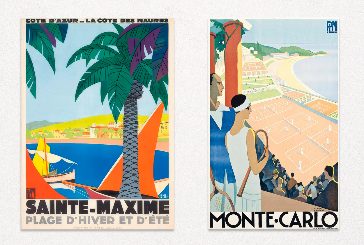
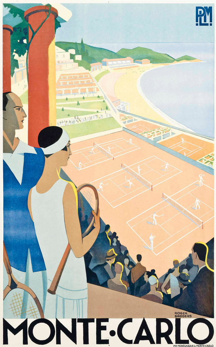
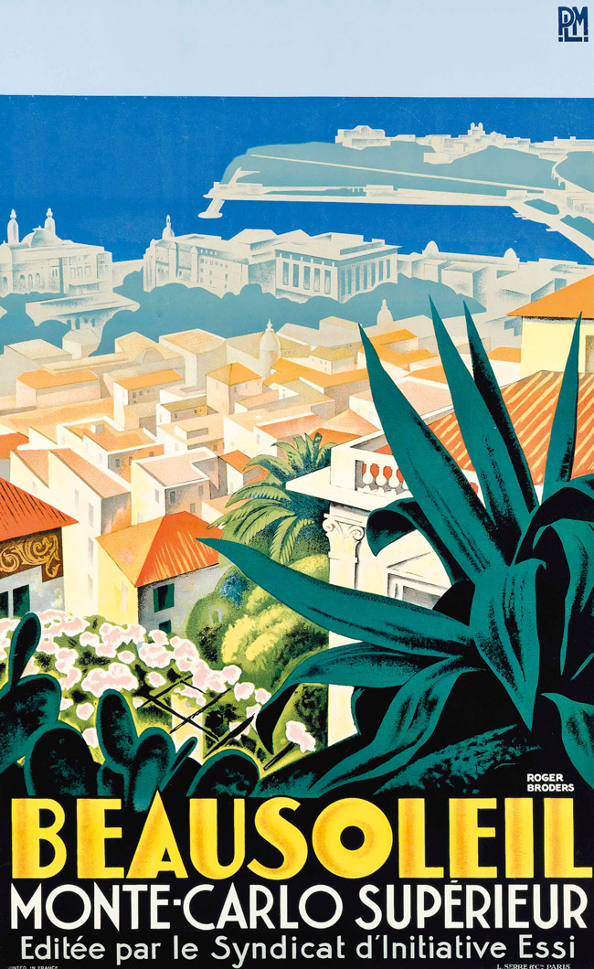
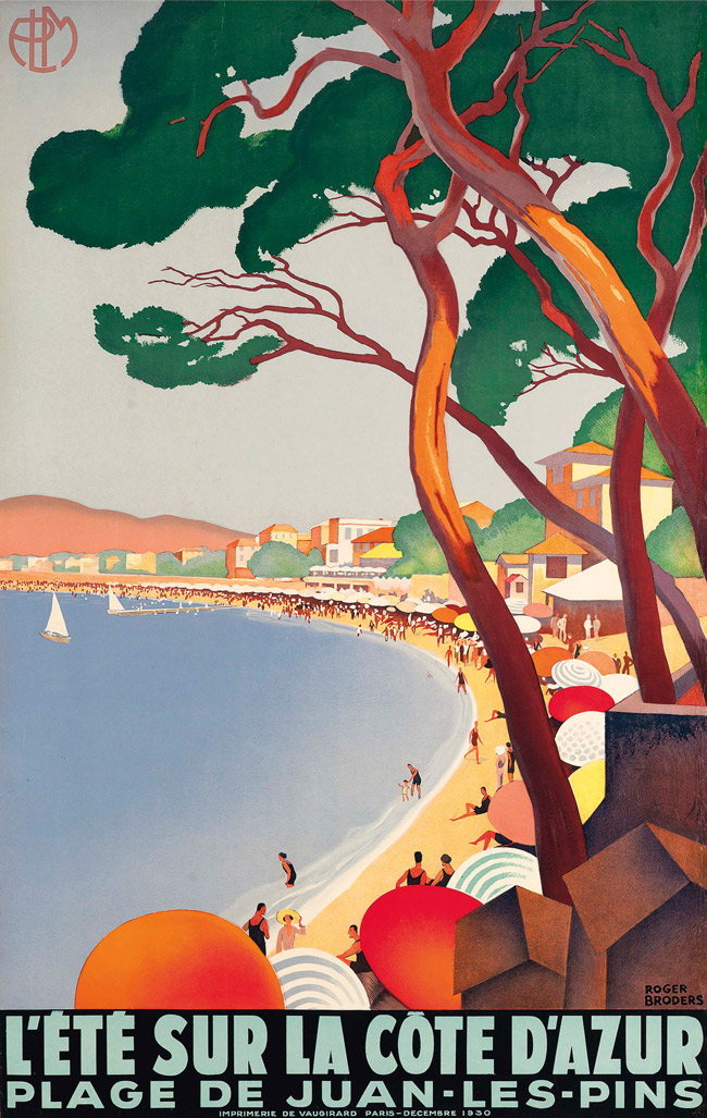

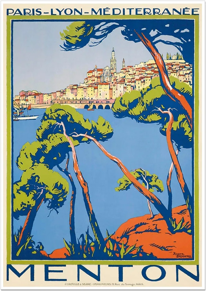
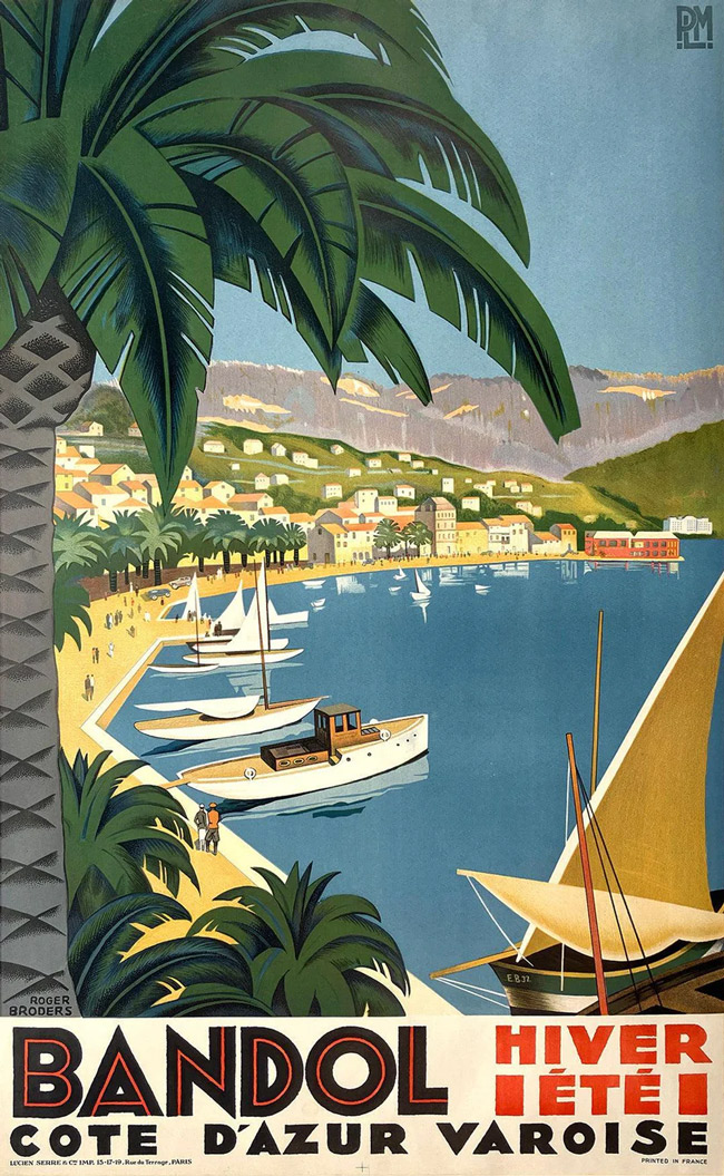
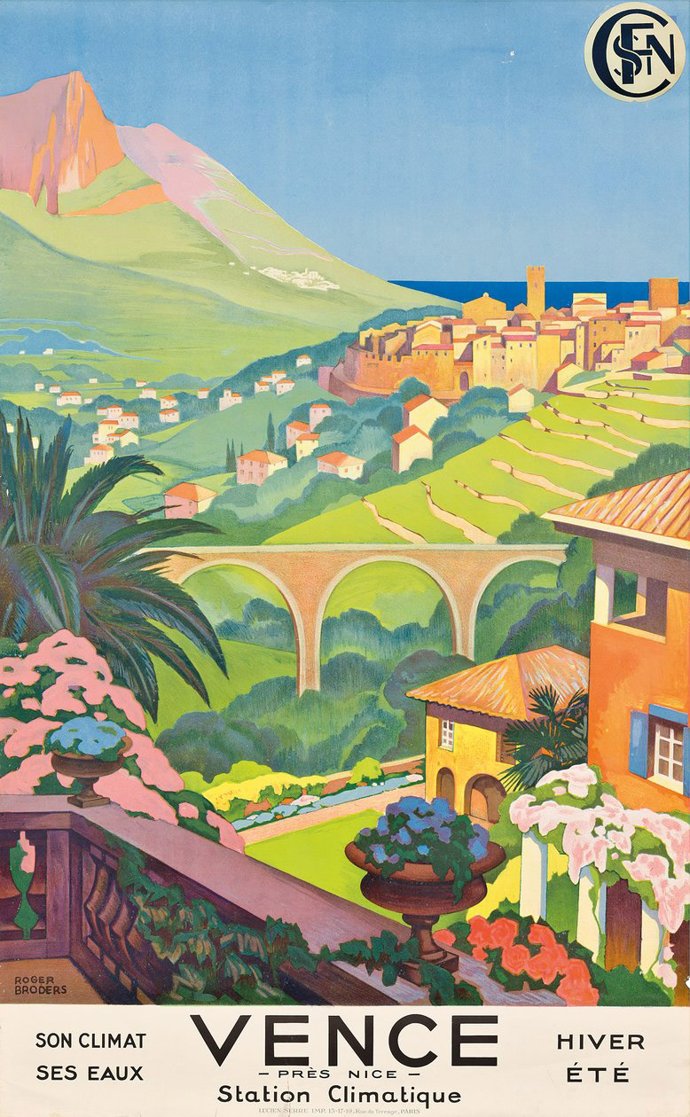
The Côte d’Azur is urbanized, densely populated, and lined with luxury yachts and modern mega-resorts. Yet 1930s travel posters – bold lines, flat vibrant colours, and sun-drenched imagery – remain the defining visual shorthand that turns Cannes, Nice, and Monaco into sleek playgrounds of leisure, parasols, and azure water, promising an escape to an uncrowded, glamorous, and idyllic “golden age” of European travel.
The emergence of Art Deco at the massive world fair in Paris in 1925, coincided with the transformation of the South of France from an aristocratic winter retreat to the newly fashionable “Côte d’Azur”, a glamorous summer playground for Coco Chanel and F. Scott Fitzgerald. A hotel and casino building boom catered to the mix of high fashion and high society, and to attract the wealthy and boost ticket sales, the railway companies – especially PLM (Paris-Lyon-Méditerranée) – embarked on a concerted campaign to promote a lifestyle of endless sunshine, yachting, and swimming. Artists were commissioned to produce bright, colour-drenched posters that glamorised the sun-kissed Mediterranean, and the vibrant, geometric style of Art Deco was perfectly suited to make them instantly recognisable and inviting in a crowded station or from a fast-moving train. Vivid contrasts, deep shadows, and solid blocks of saturated colour – ochre, azure blue, yellow, deep purple – suggested hot sun, warm sand, and lapping waves.
Probably the most recognised of the many talented artists who produced travel posters in the ’20s and ’30s was Roger Broders. His designs – produced over a fairly short period between 1920 and 1933, mostly for PLM – are what he is remembered for, rather than his earlier illustrations and later paintings.
When you glance at them, it’s easy to think the images are simple illustrations of a random destination – an idea of a lifestyle. There’s little detail, texture or activity. Boats, buildings, coastlines are featureless; colours are flat blocks; there are rarely any people. They were designed to just give you an idea of a place, a caricature rather than an accurate depiction. Yet, the simple forms manage far more accuracy from that first glance.
His designs for different destinations were all subtly different. They were still retrained, still blocks of colour – he didn’t change style or design language – but his focus shifted depending on the subject. His emphasis clearly defines the place. The designs use almost nothing to describe a place, yet still do.
Nor are the designs simple in terms of technique. As in all minimalist design, making things look simple is hard – especially if they are also to be aesthetically pleasing and functionally effective. Clean lines, colour contrasts, layered planes, and sweeping views reflect the smooth, sleek modernity of rail travel in this era. They imply glamour and chic, cocktails and yachts and romantic, aspirational train journeys to a sun-drenched, luxurious lifestyle. Broders’ designs are quiet – they don’t need added detail. They work because they don’t try to do very much.
Thousands of unique travel posters promoting the South of France were produced in the 1920s and 1930s. PLMs historic catalogue holds over 800 unique poster designs. These were distinct commissioned lithographs not mass-produced prints. Early colour lithography had improved significantly by the 1920s, allowing for strong, flat colour at speed and scale. Simplicity wasn’t just a stylistic choice – it was also practical. First-edition runs for a single poster design usually ranged up to 5,000 copies that were used to fill train stations across Europe, but because these were advertisements meant to be pasted on walls and train stations, the survival rate is extremely low and surviving originals command high prices. Broders designed fewer than 100 posters, almost all are travel posters and around 65 were for PLM.
PLMs historic catalogue holds over 800 unique poster designs. First-edition runs for a single poster design usually ranged up to 5,000 copies that were used to fill train stations across Europe. Because these were advertisements meant to be pasted on walls and train stations, the survival rate is extremely low and surviving originals command high prices. Broders designed fewer than 100 posters, almost all are travel posters and around 65 were for PLM.
Broders stopped producing posters abruptly – he is not known to have designed any after 1935. The economic climate in Europe was changing in the mid- ’30s. Rail companies were suffering and scaling back elaborate promotional campaigns; PLM and other French rail companies were merged into the state-owned SNCF in 1938. In addition, the Art Deco style was peaking, photography was growing in popularity, and Broders – passionate about fine art – had never intended to remain a commercial artist.
So the sudden end to his poster career is understandable, but he still had an outsized and lasting impact in a short time.
